 USD
USD
You don’t need a big cabinet to make Skullpanda look good.
In fact, small spaces often create better displays—because they force you to be selective, intentional, and clean.
The problem most collectors have isn’t space.
It’s trying to display too much at once.
Here’s how to build a Skullpanda setup that looks premium—even on a small desk or shelf.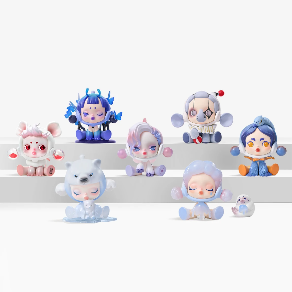
Small space display starts with restraint.
Instead of showing everything:
A crowded shelf makes even high-quality figures look cheap.
A spaced-out shelf makes even a small collection look curated.
👉 Fewer figures = stronger visual impact
Most people only use flat surfaces. That wastes half your display potential.
Try:
This creates layers:
It also helps each figure stay visible without needing more width.
👉 Vertical layout = more display without more space
Mixing too many series in a small space creates visual noise.
Instead:
For example:
This keeps your shelf looking intentional instead of random.
In small spaces, background matters more than you think.
Best options:
Avoid:
👉 The background should support the figures, not fight them
Lighting is the fastest way to upgrade a small display.
Use:
Good lighting:
👉 A $10 light can improve your display more than another figure
Not every figure needs equal attention.
Choose:
Then:
This creates a natural focal point and avoids a flat, boring layout.
Small spaces often have overlooked spots:
These are perfect for:
👉 You don’t need more space—just smarter placement
A powerful trick most beginners ignore.
Instead of displaying everything:
Benefits:
👉 Rotation = more enjoyment without buying more
Small displays show dust faster.
Basic maintenance:
Clean figures always look more premium than dusty rare ones.
Different Skullpanda styles need different setups:
This alignment makes your shelf feel designed, not accidental.
A great Skullpanda display in a small space is not about size—it’s about control.
Focus on:
If you do those five things well, even a tiny shelf can look like a curated designer display.
Small space isn’t a limitation.
It’s an advantage—if you use it correctly.


 Hot Sales
 Trending
 PRE ORDER
 Daily updates
 BLIND BOX
 PLUSH PRENDANT
 Plush Doll
 BJD
BJD FIGURES
 MINI BEANS
 Master Collector
 Region restriction
 MEGA
MEGA SkullPanda
 Labubu
 SONNY ANGEL
 Mofusand
 Crybaby
 Nommi
Nommi Maymei
 Hirono
 Wakuku
 Sanrio
 Molly
Molly Royal Molly
 Twinkle Twinkle
 Dimoo
Dimoo BABY THREE
 Sleepless Grumpipi
 Azura
Azura Winnie the Pooh
 Peach Riot
 Pino Jelly
 Kubo
Kubo Chaka
Chaka Pucky
Pucky Nyota
Nyota Zsiga
Zsiga Hacipupu
 Shin-chan
 Naruto
 Spongebob
 DORA
DORA PPG
PPG Smiski
 FARMER BOB
 Cups
Cups Phone
Phone Toy Clothes
 Bags
Bags Card Holders
 Skullpanda Swarovski
 Labubu Swarovski
 Crybaby Swarovski